CSS概念
CSS(Cascading Style Sheets)层叠样式表,又叫级联样式表,简称样式表
CSS文件后缀名为 .css
CSS用于HTML文档中元素样式的定义
CSS的作用:可以使网页具有美观一致的页面
语法
CSS规则由两个主要的部分组成:选择器,以及一条或多条声明
1
| h1 {color:bule;font-size:12px;}
|
选择器通常是需要改变样式的HTMl元素
每条声明都由一个属性和一个值组成
属性(property) 是希望设置的样式属性(style attribute)。每个属性有一个值。属性和值被冒号分开
1
2
3
4
5
6
7
8
9
10
11
12
13
14
15
16
17
18
19
20
21
22
23
24
| <!DOCTYPE html>
<html lang="en">
<head>
<meta charset="UTF-8">
<meta name="viewport" content="width=device-width, initial-scale=1.0">
<title>Document</title>
<style>
h1{
color: red;
font-size: 200px;
}
p{
color: brown;
font-size: 100px;
}
</style>
</head>
<body>
<h1>一级标题</h1>
<p>段落</p>
</body>
</html>
|

内联样式(行内样式)
要使用内联样式,需要在相关的标签内使用样式属性。style属性可以包含任何CSS属性
注意:缺乏整体性和规划性,不利于维护 。(维护成本太高)
1
| <p style="background: orange; font-size: 24px;">CSS<p>
|
内部样式
1
| 当单个文档需要特殊的样式时,就应该使用内联样式表。就可以使用<style>标签在文档头部定义内部样式表
|
注:单个页面内的CSS代码具有统一性和规划性,便于维护,但是在多个页面之间容易混乱
1
2
3
4
5
6
7
| <head>
<style>
h1{
background: red;
}
</style>
</head>
|
外部样式(推荐)
1
| 当样式需要应用与很多页面时,外部样式表是最优选择。在使用外部样式表的情况下,可以通过改变一个文件来改变整个站点的外观。每个页面使用<link>标签链接到样式表。<link>标签在(文档的)头部
|
示例:创建三个文件且在同意文件夹

home.html
1
2
3
4
5
6
7
8
9
10
11
12
13
| <!DOCTYPE html>
<html lang="en">
<head>
<meta charset="UTF-8">
<meta name="viewport" content="width=device-width, initial-scale=1.0">
<title>Document</title>
<link rel="stylesheet" href="public.css">
</head>
<body>
<p>我是首页</p>
<a href="ex.html">产品</a>
</body>
</html>
|
ex.html
1
2
3
4
5
6
7
8
9
10
11
12
| <!DOCTYPE html>
<html lang="en">
<head>
<meta charset="UTF-8">
<meta name="viewport" content="width=device-width, initial-scale=1.0">
<title>Document</title>
<link rel="stylesheet" href="public.css">
</head>
<body>
<p>产品</p>
</body>
</html>
|
public.css
1
2
3
4
| p{
color: red;
font-size: 20px;
}
|
效果


CSS语法 规则由两个主要部分构成: 选择器,以及一条或多条声明(样式)
全局选择器
可以与任何元素匹配,优先级最低,一般做样式初始化
1
2
3
4
| *{
margin: 0;
padding: 0;
}
|
元素选择器
HTML文档中的元素,p、b、div、a、img、body、等。
标签选择器,选择的是页面上所有这种类型的标签,所以经常描述“共性”,无法描述某一个元素的“个性”
1
| 例如,让“学完基础,再学java”这句话中的“前端”两个变为红色字体,那么我们可以用<span>标签把“前端”包裹起来,在给<span>标签加一个标签选择器。
|
1
2
3
4
5
6
7
8
9
10
11
12
13
14
15
16
17
18
19
20
| <!DOCTYPE html>
<html lang="en">
<head>
<meta charset="UTF-8">
<meta name="viewport" content="width=device-width, initial-scale=1.0">
<title>Document</title>
<style>
p{
font-size: 40px;
}
span{
color: red;
}
</style>
</head>
<body>
<p>学完<span>基础</span>,在学java</p>
</body>
</html>
|

注:
- 所有的标签,都可以是选择器。比如ul、li、label、dt、dl、inout、div等
- 无论这个标签藏得多深,都可以被选择上
- 选择的所有,为不是一个
类选择器
规定用圆点 . 来定义,针对想要使用的所有标签使用
优点
灵活
1
2
3
4
5
6
7
8
9
10
11
12
13
14
15
16
17
18
| <!DOCTYPE html>
<html lang="en">
<head>
<meta charset="UTF-8">
<meta name="viewport" content="width=device-width, initial-scale=1.0">
<title>Document</title>
<style>
.emo{
color:red;
}
</style>
</head>
<body>
<p>i am happy</p>
<p>i am loney</p>
<p class="emo">i am emo</p>
</body>
</html>
|

class属性的特点
- 类选择器可以被多种标签使用
- 类名不能以数字开头
- 同一个标签可以使用多个类选择器。用空格隔开
1
2
3
4
5
6
7
8
9
10
11
12
13
14
15
16
17
18
19
| <!DOCTYPE html>
<html lang="en">
<head>
<meta charset="UTF-8">
<meta name="viewport" content="width=device-width, initial-scale=1.0">
<title>Document</title>
<style>
.test{
color:red;
}
</style>
</head>
<body>
<h3 class="dev test">我是h3</h3> 正确
<h3 class="dev" class="test">我是h3</h3> 错误示范
</body>
</html>
|

ID选择器
针对某一个特定的标签来使用,只能使用一次。css中的ID选择器以**#**来定义
1
2
3
4
5
6
7
8
9
10
11
12
13
14
15
16
17
| <!DOCTYPE html>
<html lang="en">
<head>
<meta charset="UTF-8">
<meta name="viewport" content="width=device-width, initial-scale=1.0">
<title>Document</title>
<style>
#test{
color: red;
}
</style>
</head>
<body>
<p id="test">段落,你好</p>
</body>
</html>
|
注:
- ID是唯一的
- ID不能以数字开头
合并选择器
语法:选择器1、选择器2,…{}
作用:提供共同的样式,减少重复代码
1
2
3
4
5
6
7
8
9
10
11
12
13
14
15
16
17
18
| <!DOCTYPE html>
<html lang="en">
<head>
<meta charset="UTF-8">
<meta name="viewport" content="width=device-width, initial-scale=1.0">
<title>Document</title>
<style>
p,h3{
color: red;
font-size: 20px;
}
</style>
</head>
<body>
<p>我是p标签</p>
<h3>我是h3标签</h3>
</body>
</html>
|
选择器的优先级
CSS中,权重用数字衡量
元素选择器的权重为:1
class选择器的权重为:10
id选择器的权重为:100
内联样式的权重为:1000
优先级从高到底:行内样式>ID选择器>类选择器>元素选择器
color

字体属性
font-wegiht
设置文本的粗细,在head中的style里面进行修改

font-style
指定文本的字体样式

font-family
font-family属性指定一个元素的字体

CSS背景属性

设置背景色和大小
1
2
3
4
5
6
7
8
9
10
11
12
13
14
15
16
17
18
| <!DOCTYPE html>
<html lang="en">
<head>
<meta charset="UTF-8">
<meta name="viewport" content="width=device-width, initial-scale=1.0">
<title>Document</title>
<style>
div{
background-color: red;
width: 400px;
height: 400px;
}
</style>
</head>
<body>
<div></div>
</body>
</html>
|

设置背景图片
1
2
3
4
5
6
7
8
9
10
11
12
13
14
15
16
17
18
19
20
21
22
23
24
25
| <!DOCTYPE html>
<html lang="en">
<head>
<meta charset="UTF-8">
<meta name="viewport" content="width=device-width, initial-scale=1.0">
<title>Document</title>
<style>
.d1{
background-color: red;
width: 400px;
height: 400px;
}
.d2{
width: 678px;
height: 1122px;
background-image: url("1.png");
}
</style>
</head>
<body>
<div class="d1"></div>
<div class="d2"></div>
</body>
</html>
|

background-repeat属性
该属性设置如何平铺背景图像


background-size属性
设置背景图像大小

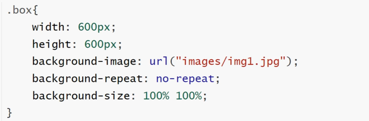
background-position属性
作用:设置背景图片的起始位置,其默认为:0% 0%


text-transform
text-transform属性控制文本的大小写
| 值 |
描述 |
| captialize |
定义每个单词开头大写 |
| uppercase |
定义全部大写字母 |
| lowercase |
定义全部小写字母 |
1
2
3
4
5
6
7
8
9
10
11
12
13
14
15
16
17
18
19
20
21
22
23
24
| <!DOCTYPE html>
<html lang="en">
<head>
<meta charset="UTF-8">
<meta name="viewport" content="width=device-width, initial-scale=1.0">
<title>Document</title>
<style>
h1{
text-transform: uppercase;
}
h2{
text-transform: capitalize;
}
h3{
text-transform: lowercase;
}
</style>
</head>
<body>
<h1>以及标记ASE,des</h1>
<h2>二级标记ASE,des</h2>
<h3>三级标题AES,des</h3>
</body>
</html>
|

text-decoration
text-decoration属性规定添加到文本的修饰,下划线,上划线,删除线等
| 值 |
描述 |
| underline |
定义下划线 |
| overline |
定义上划线 |
| line-through |
定义删除线 |
1
2
3
4
5
6
7
8
9
10
11
12
13
14
15
16
17
18
19
20
21
22
23
24
| <!DOCTYPE html>
<html lang="en">
<head>
<meta charset="UTF-8">
<meta name="viewport" content="width=device-width, initial-scale=1.0">
<title>Document</title>
<style>
h1{
text-decoration: underline;
}
h2{
text-decoration: overline;
}
h3{
text-decoration: line-through;
}
</style>
</head>
<body>
<h1>以及标记</h1>
<h2>二级标记</h2>
<h3>三级标题</h3>
</body>
</html>
|

text-indent
text-indent属性规定文本块中首行文本的缩进
注:负值是允许的,如果值是负数,将第一行左缩进
表格属性
width和height属性定义表格的宽度和高度
1
2
| table { width:100%;}
td {height:50px;}
|
表格文字对齐
表格中的文本对齐和垂直对齐属性
text-aligh属性设置水平对齐方式,向左,右,或中心
垂直对齐属性设置垂直对齐
1
| td {height:50px; vertical-align:bottom;}
|
表格填充
如果在表的内容中控制空格之间的边框,应使用td和th元素的填充属性
表格颜色
下面的例子指定边框的颜色,和th元素的文本和背景色
1
2
| table,td,th{border:1px solid green;}
td {background-color:green;color:white;}
|
关系选择器
关系选择器分类
- 后代选择器
- 子代选择器
- 相邻兄弟选择器
- 通用兄弟选择器
后代选择器
定义
选择所有被E元素包含的F元素,中间用空格隔开
语法
1
2
3
4
5
6
7
8
9
10
11
12
13
14
15
16
17
18
19
20
21
22
23
24
| <!DOCTYPE html>
<html lang="en">
<head>
<meta charset="UTF-8">
<meta name="viewport" content="width=device-width, initial-scale=1.0">
<title>Document</title>
<style>
ul li{
color: red;
}
</style>
</head>
<body>
<ul>
<li>例子1</li>
<li>例子2</li>
<p>测试2</p>
<ol>
<li>测试</li>
</ol>
<li>例子3</li>
</ul>
</body>
</html>
|

子代选择器
定义
选择所有作为E元素的直接子元素F,对更深一点的元素不起作用,用>表示
语法
1
2
3
4
5
6
7
8
9
10
11
12
13
14
15
16
17
18
19
20
21
22
23
24
25
26
| <!DOCTYPE html>
<html lang="en">
<head>
<meta charset="UTF-8">
<meta name="viewport" content="width=device-width, initial-scale=1.0">
<title>Document</title>
<style>
div>p{
color: red;
}
</style>
</head>
<body>
<div>
<p>father</p>
<ul>
<li>
<p>
son
</p>
</li>
</ul>
</div>
</body>
</html>
|

相邻兄弟选择器
定义
选择紧跟E元素后的F元素,用加号表示,选择相邻的第一个兄弟元素,只能向下选择
语法
1
2
3
4
5
6
7
8
9
10
11
12
13
14
15
16
17
18
19
| <!DOCTYPE html>
<html lang="en">
<head>
<meta charset="UTF-8">
<meta name="viewport" content="width=device-width, initial-scale=1.0">
<title>Document</title>
<style>
h3+p{
color: red;
}
</style>
</head>
<body>
<h3>三级标题</h3>
<p>内容一</p>
<p>内容二</p>
</body>
</html>
|

通用兄弟选择器
定义
选择E元素之后的所有兄弟元素F,作用与多个元素,用~隔开,只能向下选择
语法
1
2
3
4
5
6
7
8
9
10
11
12
13
14
15
16
17
18
19
20
21
| <!DOCTYPE html>
<html lang="en">
<head>
<meta charset="UTF-8">
<meta name="viewport" content="width=device-width, initial-scale=1.0">
<title>Document</title>
<style>
h3~p{
color: red;
}
</style>
</head>
<body>
<p>内容四</p>
<h3>三级标题</h3>
<p>内容一</p>
<p>内容二</p>
<div>测试</div>
<p>内容三</p>
</body>
</html>
|

CSS盒子模型(Box Model)
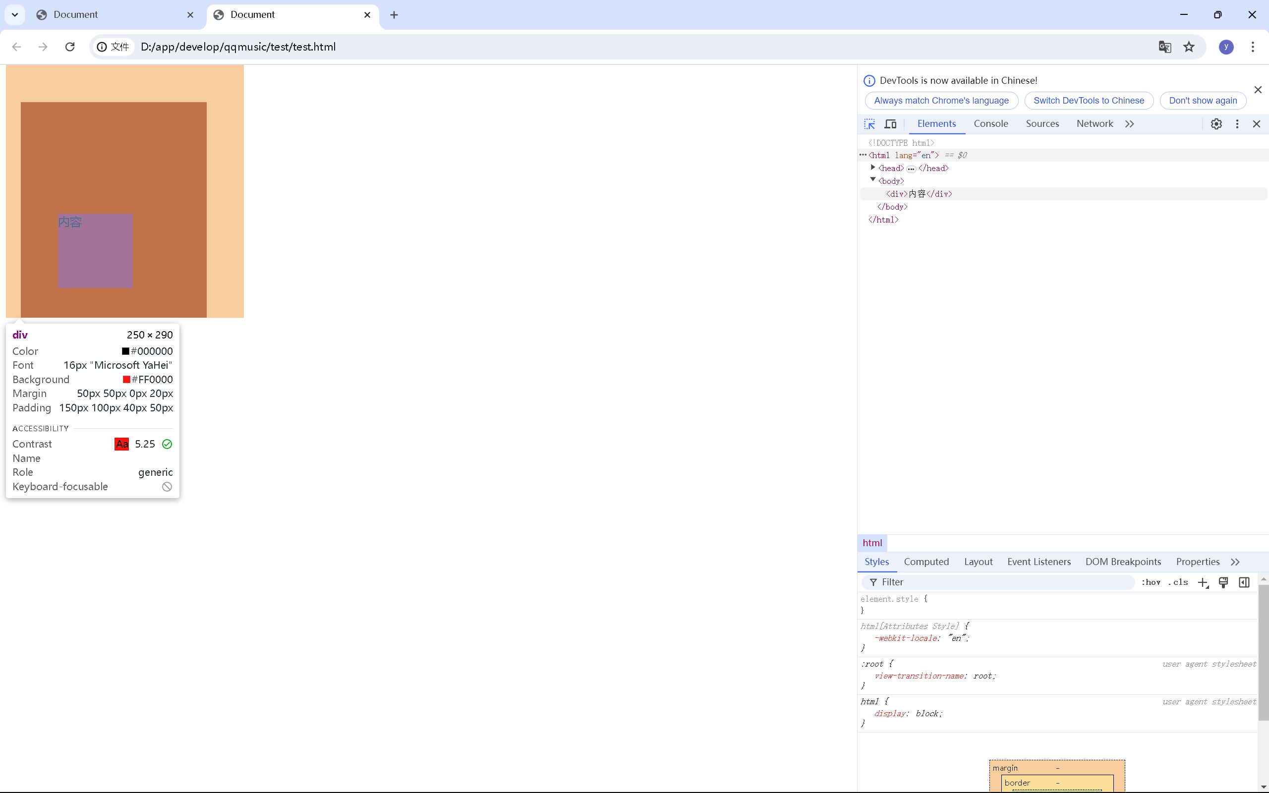
概念HTML元素可以看作盒子,在CSS中,”box model”这一术语是用来设计和布局时使用CSS盒模型本质上时一个盒子,封装周围HTMl元素,它包括:外边距(margin),边框(border),内边距(padding),和实际内容(content)

- Margin(外边距)-清除边框外的区域,外边距是透明的(两个值:第一个值上下,第二个值左右)
- Border(边框)-围绕在内边距和内容外的边框
- Padding(内边距)-清除内容周围的区域,内边距是透明的(两个值:第一个值上下,第二个值左右)
- Content(内容)-盒子的内容,显示文本和图像
如果把盒子模型看作是一个生活中的快递,那么内容部分类似于买的实物,内边距 等同于快递盒子中的泡沫,边框等同于快递盒子,外边框类似于两个快递盒子之间的距离
1
2
3
4
5
6
7
8
9
10
11
12
13
14
15
16
17
18
19
20
21
22
23
24
25
26
| <!DOCTYPE html>
<html lang="en">
<head>
<meta charset="UTF-8">
<meta name="viewport" content="width=device-width, initial-scale=1.0">
<title>Document</title>
<style>
div{
width: 100px;
height: 100px;
background-color: red;
padding-left: 50px;
padding-right: 100px;
padding-top: 150px;
padding-bottom: 40px;
margin-right: 50px;
margin-left: 20px;
margin-top: 50px;
margin-bottom: 50x;
}
</style>
</head>
<body>
<div>内容</div>
</body>
</html>
|
弹性盒模型(flex box)
弹性盒子是CSS3的一种新的布局模式
CSS3弹性盒是一种当页面需要适应不同的屏幕大小及设备类型时确保元素拥有恰当的行为的布局方式
引入弹性盒布局模型的目的是提供一种更加有效的方式来对一个容器中的子元素进行排列、对齐和分配空白空间
CSS弹性盒内容
弹性盒字由弹性容器(Flex container)和弹性子元素(Flex item)组成
弹性容器通过设置display属性的值为flex将其定义为弹性容器
弹性容器内包含一个或多个弹性子元素
注:弹性容器外及弹性子元素内是正常渲染的。弹性盒子只定义了弹性子元如何在弹性容器内布局
1
2
3
4
5
6
7
8
9
10
11
12
13
14
15
16
17
18
19
20
21
22
23
24
25
26
27
28
29
30
31
32
33
34
35
36
37
38
| <!DOCTYPE html>
<html lang="en">
<head>
<meta charset="UTF-8">
<meta name="viewport" content="width=device-width, initial-scale=1.0">
<title>Document</title>
<style>
.container{
width: 500px;
height: 500px;
background-color: red;
display: flex;
}
.box1{
width: 100px;
height: 100px;
background-color: blue;
}
.box2{
width: 100px;
height: 100px;
background-color: blueviolet;
}
.box3{
width: 100px;
height: 100px;
background-color: green;
}
</style>
</head>
<body>
<div class="container">
<div class="box1"></div>
<div class="box2"></div>
<div class="box3"></div>
</div>
</body>
</html>
|


justify-content属性
定义
内容对齐(justify-content)属性应用在弹性容器上,把弹性项沿着弹性容器的主轴线(main axis)对齐
语法
1
| justify-content: flex-start | flex-end |center
|

1
2
3
4
5
6
7
8
9
10
11
12
13
14
15
16
17
18
19
20
21
22
23
24
25
26
27
28
29
30
31
32
33
34
35
36
37
38
39
40
| <!DOCTYPE html>
<html lang="en">
<head>
<meta charset="UTF-8">
<meta name="viewport" content="width=device-width, initial-scale=1.0">
<title>Document</title>
<style>
.container{
width: 500px;
height: 500px;
background-color: red;
display: flex;
flex-direction: column;
justify-content: center;
}
.box1{
width: 100px;
height: 100px;
background-color: blue;
}
.box2{
width: 100px;
height: 100px;
background-color: blueviolet;
}
.box3{
width: 100px;
height: 100px;
background-color: green;
}
</style>
</head>
<body>
<div class="container">
<div class="box1"></div>
<div class="box2"></div>
<div class="box3"></div>
</div>
</body>
</html>
|

align-items属性
定义
align-tiems设置或检索弹性盒子元素在侧轴(纵轴)方向上的对齐方式
语法


1
2
3
4
5
6
7
8
9
10
11
12
13
14
15
16
17
18
19
20
21
22
23
24
25
26
27
28
29
30
31
32
33
34
35
36
37
38
39
40
41
| <!DOCTYPE html>
<html lang="en">
<head>
<meta charset="UTF-8">
<meta name="viewport" content="width=device-width, initial-scale=1.0">
<title>Document</title>
<style>
.container{
width: 500px;
height: 500px;
background-color: red;
display: flex;
flex-direction: column;
justify-content: center;
align-items: center;
}
.box1{
width: 100px;
height: 100px;
background-color: blue;
}
.box2{
width: 100px;
height: 100px;
background-color: blueviolet;
}
.box3{
width: 100px;
height: 100px;
background-color: green;
}
</style>
</head>
<body>
<div class="container">
<div class="box1"></div>
<div class="box2"></div>
<div class="box3"></div>
</div>
</body>
</html>
|

子元素上的属性
flex-grow
flex-grow 根据弹性盒子元素所设置的扩展作为比率来分配剩余空间

1
2
3
4
5
6
7
8
9
10
11
12
13
14
15
16
17
18
19
20
21
22
23
24
25
26
27
28
29
30
31
32
33
34
35
36
37
38
39
40
41
42
43
44
| <!DOCTYPE html>
<html lang="en">
<head>
<meta charset="UTF-8">
<meta name="viewport" content="width=device-width, initial-scale=1.0">
<title>Document</title>
<style>
.container{
width: 500px;
height: 500px;
background-color: red;
display: flex;
flex-direction: row;
justify-content: center;
align-items: center;
}
.box1{
width: 100px;
height: 100px;
background-color: blue;
flex: 3;
}
.box2{
width: 100px;
height: 100px;
background-color: blueviolet;
flex: 1;
}
.box3{
width: 100px;
height: 100px;
background-color: green;
flex: 1;
}
</style>
</head>
<body>
<div class="container">
<div class="box1"></div>
<div class="box2"></div>
<div class="box3"></div>
</div>
</body>
</html>
|

文档流是文档中可显示对象在排列时所占用的位置/空间
例如:块元素自上而下摆放,内联元素,从左到右摆放
标准流里面的限制非常多,导致很多页面效果无法实现

文档流产生的问题
高矮不齐,底边对齐
1
2
| <span>文本内容</span>
<img src="1.jpg" alt="">
|
1
2
3
4
5
6
7
8
9
10
11
12
13
14
15
16
17
18
| <!DOCTYPE html>
<html lang="en">
<head>
<meta charset="UTF-8">
<meta name="viewport" content="width=device-width, initial-scale=1.0">
<title>Document</title>
<style>
img{
width: 300px;
height: 500px;
}
</style>
</head>
<body>
<p>文本内容</p>
<img src="1.png" alt="">
</body>
</html>
|

空格折叠现象
1
2
| <span>我是文本 内容</span>
<img src="1.png" alt="">
|
如果我们需要并排顶部对齐,那该怎么办?
–脱离标准流
脱离文档流
使一个元素脱离标准文档流有三种方式
浮动的定义
float属性定义元素在哪个方向浮动,任何元素都可以浮动
| 值 |
描述 |
| left |
元素向左浮动 |
| right |
元素向右浮动 |
浮动的原理
- 浮动以后使元素脱离了文档流
- 浮动后只有左右浮动,没有上下浮动
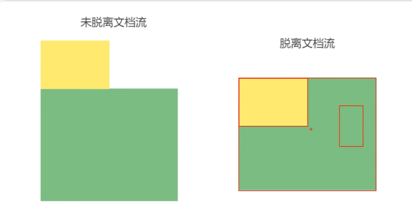
元素向左浮动
脱离文档流之后,元素相当于在页面上面增加一个浮动层来放置内容。此时可以理解为有两层页面,一层是底层的原页面,一层是脱离文档流的上层页面,所以会出现折叠现象
1
2
| <div class="box"></div>
<div class="container"></div>
|
浮动副作用
当元素设置float浮动后,该元素就会脱离文档流并向左/向右浮动
- 浮动元素会造成父元素高度塌陷
- 后续元素会受到影响
清除浮动
(清楚浮动带来的副作用)
- 父元素设置高度
- 受影响的元素增加clear属性
- overflow清楚浮动
- 伪对象方式
定位
position属性制定了元素的定位类型
| 值 |
描述 |
| relative |
相对定位 |
| absolute |
绝对定位 |
| fixed |
固定定位 |
注:绝对定位和固定定位会脱离文档流
设置定位之后:可以使用四个方向值进行调整位置:left、top、right、bottom
相对定位
绝对定位
1
2
3
4
5
6
7
8
9
10
11
12
13
14
15
16
17
18
19
20
21
22
23
24
25
26
27
28
29
30
31
32
33
34
35
36
37
| <!DOCTYPE html>
<html lang="en">
<head>
<meta charset="UTF-8">
<meta name="viewport" content="width=device-width, initial-scale=1.0">
<title>Document</title>
<style>
.d1{
background-color: rgb(48, 214, 240);
width: 300px;
height: 300px;
}
.d2{
background-color: red;
width: 200px;
height: 200px;
position: absolute;
left: 100px;
top: 80px;
}
.d3{
background-color: blueviolet;
height: 200px;
width: 200px;
position: absolute;
left: 50px;
top: 50px;
}
</style>
</head>
<body>
<div class="d1"></div>
<div class="d2"></div>
<div class="d3"></div>
</body>
</html>
|

固定定位
绝对定位与固定定位的区别:绝对定位的基准是页面,固定定位的基准是屏幕(类似于手机绝对定位是不同的页面的具体元素,固定定位是下面的导航栏)
注:设置定位后,相对定位和绝对定位是相对于具有定位的父级元素进行位置进行调整的,如果父级元素不存在定位,则继续向上逐级寻找,直到顶层文档。
圆角
使用CSS3 border-radius 属性,可以给任何元素制作“圆角”
border-radius 属性:
- 四个值:第一个值为左上角,第二个值为右上角,第三个值为右下角,第四个值为左下角
- 三个值:左上,右上和左下,右下
- 两个值:左上与右下,右上与左下
- 一个值:四个圆角值相同
1
2
| border-radius: 15px 50px 30px 5px;
border-radius:100%
|
阴影
box-shadow向框添加一个或多个阴影。
1
| box-shadow: h-shadow v-shadow blur color;
|
| 值 |
描述 |
| h-shadow |
必选-水平阴影的位置 |
| v-shadow |
必选,垂直阴影的位置 |
| blur |
可选,模糊距离 |
| color |
可选,阴影的颜色 |
1
| box-shadow: 10px 10px 5px blue
|
动画
动画是使元素从一种样式逐渐变化为另一种样式的效果
用百分比来规划变化发生的时间,或用关键词”from”和”to”,等同于0%和100%
0%是动画的开始,100%是动画的完成
@keyframes创建动画
使用@keyframes规则,可以用来创建动画
1
2
3
4
5
6
7
8
9
10
11
| @keyframes name{
from | 0%{
样式1
}
percent{
样式过渡
}
to | 100%{
样式结尾
}
}
|
name:动画名称,开发人员命名;
percent: 为百分比,可以添加多个百分比的值;
animation执行动画
1
| animation: name duration timing-function delay iteration-count direction;
|
| 值 |
描述 |
| name |
设置动画的名称 |
| duration |
设置动画的持续时间 |
| timing-function |
设置动画效果的速率(如下) |
| delay |
设置动画的开始时间(延时执行) |
| iteration-count |
设置动画循环的次数,infinite为无限次数的循环 |
| direction |
设置动画播放的方向(如下) |
| animation-play-state |
控制动画的播放状态:running代表播放,而paused代表停止播放 |
| timing-function值 |
描述 |
| ease |
逐渐变慢(默认) |
| linear |
匀速 |
| ease-in |
加速 |
| ease-out |
减速 |
| ease-in-out |
先加速后减速 |
| direction值 |
描述 |
| normal |
默认值为normal表示向前播放 |
| alternate |
动画播放在第偶数次向前播放,第奇数次向反方向播放 |
1
2
3
4
5
6
7
8
9
10
11
12
13
14
15
16
17
18
19
20
21
22
23
24
25
26
27
28
29
30
31
32
33
34
35
| <!DOCTYPE html>
<html lang="en">
<head>
<meta charset="UTF-8">
<meta name="viewport" content="width=device-width, initial-scale=1.0">
<title>Document</title>
<style>
div{
height: 200px;
width: 200px;
background-color: azure;
animation: do 3s linear 0s infinite;
}
div:hover{
animation-play-state: paused;
}
@keyframes do{
0%{
background-color: red;
}
50%{
background-color: blueviolet;
}
100%{
background-color: bisque;
}
}
</style>
</head>
<body>
<div></div>
</body>
</html>
|
上述代码实现一个正方形渐变颜色的效果
媒体查询
媒体查询可以使得页面在不同的终端设备下达到不同的效果
媒体查询会根据设备的大小自动设别加载不同的样式
设置mata标签
1
| 使用设备的宽度作为视图宽度并禁止初始的缩放。在<head>标签里加入这个meta标签
|
1
| <meta name="viewport" content="width=device-width, initial-scale=1,maximum-scale=1,use-scalable=no">
|
参数讲解:
- width=device-width宽度等于当前设备的宽度
- inital-scale 初始的缩放比例(默认设置为1.0)
- maximum-scale 允许用户缩放到的最大比例(默认设置为1.0)
- user-scalable 用户是否可以手动缩放(默认设置为no)
具体应用

CSS Sprite(又名CSS精灵图、CSS雪碧图),是一种网页图片处理方式。
优点
- 减少图片的字节
- 减少网页的http请求,从而大大的提高页面的性能
原理
- 通过background-image引入背景图片
- 通过background-position吧背景图片移动到自己需要的位置

字体图标
优点
- 轻量性:加载速度快,减少htto请求
- 灵活性:可以利用CSS设置大小颜色等
- 兼容性:网页字体支持所有现代浏览器,包括IE低版本
使用字体图标
- 注册账号并登录
- 选取图标或搜索图标
- 添加购物车
- 下载代码
- 选择font-class引用
引入和使用的语法



评论区
欢迎你留下宝贵的意见,昵称输入QQ号会显示QQ头像哦~